US
US AU
AU UK
UK SG
SG
A conversation with Andy Shand, Head of Safety, Wellbeing and Risk at Z Energy, on making safety information more useful for the people who need to act on it.
Safety teams have no shortage of information. Incidents are reported, hazards logged, inspections completed and actions tracked, with dashboards typically bringing all of it together.
The harder task is turning those numbers into a useful picture of what is actually happening across the business.
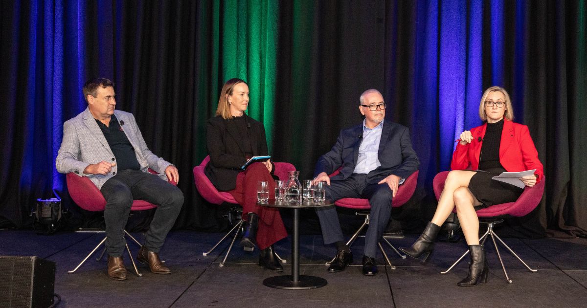
At the 2026 HASANZ Conference in Wellington, Z Energy’s Head of Safety, Wellbeing and Risk, Andy Shand, spoke with Donesafe Product Marketing Manager Justin Uy about that gap and what organisations can do to close it.
A recurring theme was the need to make safety information useful for the people who rely on it. That means understanding what the information is telling you, what it is missing and what decision it is there to support.
A full set of green metrics does not necessarily mean you’re in control
A healthy-looking set of safety metrics does not necessarily mean the organisation has a clear picture of the risks that matter most. As Andy discussed, activity can show that a process is happening without showing what is happening with the underlying risk.
With inspections completed, actions closed and incident numbers low, it can be easy to assume that everything is under control.
An inspection being completed tells you that the inspection happened. It does not necessarily tell you what was found, whether the same issue is appearing elsewhere or whether the control is working in practice.
The same applies to action closure. An action can be marked complete without resolving the underlying issue.
Activity measures still have an important role. They tell you whether parts of a safety process are happening. The challenge comes when those measures are treated as a proxy for how effectively risk is being managed.
That distinction matters when safety information is being used at an organisational level. Leaders need to understand not only what has been done, but what that activity tells them about the risks the business is carrying.
The number needs some context
Andy used manual-handling injuries to illustrate how quickly the picture can change when safety data is considered alongside operational activity.
Imagine two sites where one has recorded more manual-handling injuries than the other. On the surface, that site might appear to have the bigger problem. But if it is also moving significantly more product or has a much larger workforce, the interpretation changes.
The incident number itself is still correct, but the interpretation changes once you understand the work happening behind it.
The point is not to bring every piece of business data into the safety system. It is to identify the information that helps explain what you are seeing.
As Andy emphasised, a metric can be accurate and still lead you towards the wrong conclusion if you don’t understand the conditions around it.
Critical controls need more than a risk score
Risk assessments and risk ratings have an important place in safety management, but a score alone cannot tell you whether an important control is working as intended. Andy’s discussion of critical risk brought the distinction into sharper focus: the question is what sits behind the score and how the organisation knows those controls are working.
That requires evidence from control checks, inspections, incidents, hazards, observations or conversations with workers. Each provides a different view of what is happening in practice.
Worker experience adds another layer of evidence. A control can look effective in a report while being difficult to apply in practice or no longer fitting the way work is actually being done.
This is where a critical control approach can provide a more focused view by concentrating on the controls that matter most and the evidence that shows whether they are working as intended.
Sometimes the useful information sits outside the safety system
Almost any information about how a business operates can potentially have relevance to risk. That does not mean all of it belongs in a safety platform.
The key consideration is whether the additional information changes how you understand the risk.
Andy used driver risk as an example of how different types of information can contribute to a fuller picture. Information about work patterns or fatigue could provide one indication of risk, while weather, road conditions and other external factors could add important context.
The example discussed at HASANZ was illustrative rather than a description of Z Energy’s current system.
For safety teams, that creates an opportunity to think beyond the information generated by the safety process itself and consider what operational context is needed to interpret it properly.
A dashboard should help you see what needs attention
One example discussed at HASANZ was the familiar map showing where incidents, hazards or other safety activity are occurring across New Zealand. It can look compelling when some locations show significantly more activity than others.
If Auckland is one of the organisation’s busiest operating areas, a higher number of incidents or safety events may simply reflect the amount of work taking place there.
The data may be accurate, but the map alone does not tell you whether Auckland has a higher level of risk. Without understanding the amount of work taking place, the size of the workforce or other relevant operational factors, the number can easily be interpreted without enough context.
What does the number tell you?
The value comes from understanding what the numbers tell you about risk, what has changed and whether anything requires attention.
Andy used the analogy of an aircraft cockpit to describe how information should be presented. A pilot needs the information required to understand what is happening and make a decision, with more detail available when they need to investigate further.
The same principle applies to safety dashboards. A dashboard can contain dozens of useful metrics and still leave someone opening multiple reports, systems or spreadsheets to understand what is happening. The information most relevant to the decision should be visible immediately, with detail available when further investigation is needed.
What needs to be visible will depend on who is using the information. A critical control owner may need control checks, observations and related incidents, while an executive may need to understand where exposure is changing and where attention is required. The dashboard should help the user learn what is happening and decide what to do next.
When the data raises a question
Safety data will not always provide a definitive answer. Its value can be in showing where to look more closely.
A rise in incidents could reflect an increase in underlying risk, a significant increase in activity or better reporting. A fall could reflect lower activity rather than lower risk.
As Justin and Andy discussed, no single measure is likely to explain the full picture. Incident data tells you what has happened, while other measures can help explain what may be contributing to it and whether controls are operating as intended.
The aim is to build enough of a picture to know when something needs further investigation.
Put the problem first
One of Andy’s clearest messages was to start with the problem rather than the technology.
- What is the problem?
- What outcome are you trying to improve?
- What information would help you understand it?
- Who needs that information and what decision will they make with it?
Andy also shared how this thinking applied at Z Energy. Rather than trying to design for every possible need at once, the team started with a V1 view of the information different groups needed to make useful decisions. Frontline teams were important because they are closest to the work, while decision-makers needed enough information to understand what was happening and whether intervention was required.
Andy stressed that this was not a one-off consultation. Work changes, organisations change and risks change, so the information people need can change too. User input and iteration therefore need to continue as the work and the organisation evolve.
Build the connections
In larger organisations, incident information, control checks, operational data and worker feedback can sit in different places. The challenge is understanding what those sources tell you when they are considered together.
A connected safety system can bring related information together so safety teams can see the relationship between risks, controls, incidents and the work taking place around them.
For leaders, that creates a clearer view of where risk may be changing, where controls need closer attention and where the available information is telling them to look further.
It also makes the information more useful beyond the safety team. When safety data can be understood in the context of how the business actually operates, it becomes more relevant to the decisions being made across the organisation.
Start small and build from there
Andy returned to this idea in his closing advice, suggesting that organisations start with one problem and build from there rather than trying to solve every data or reporting challenge at once.
Start with a problem that matters, define the outcome you are trying to achieve and work out what information you need. From there, involve the people who use it, then build, learn and improve.
For safety leaders, the opportunity is to make the information they already have more useful by putting it in context, connecting relevant sources and making it easier to see where attention is needed.
Knowing that an inspection was completed or an action was closed is useful. Understanding what that activity tells you about risk is more useful still.
That is the gap safety intelligence needs to close.
Share: